A hand holds a phone with an app open showing data points on a grid.

New data visualization course equips students to turn data into real-world impact

By Hannah Ashton

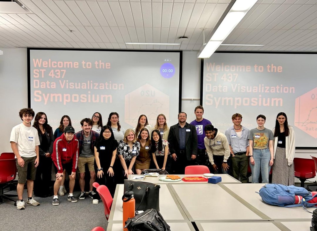
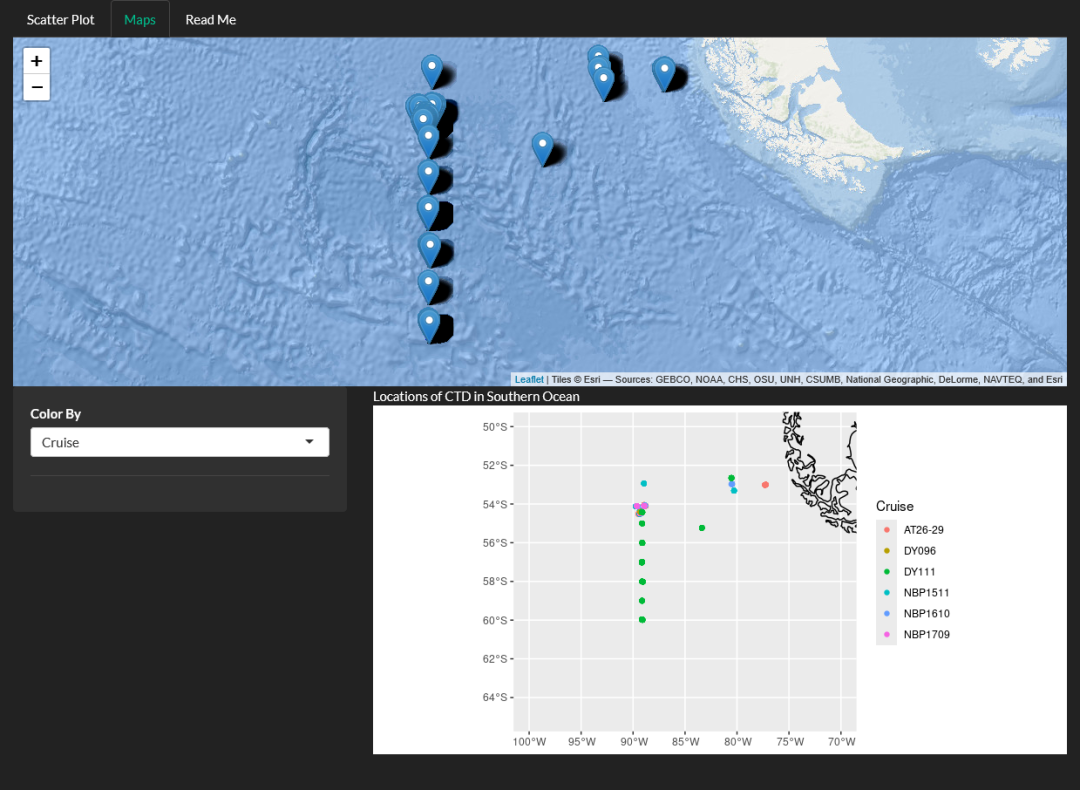
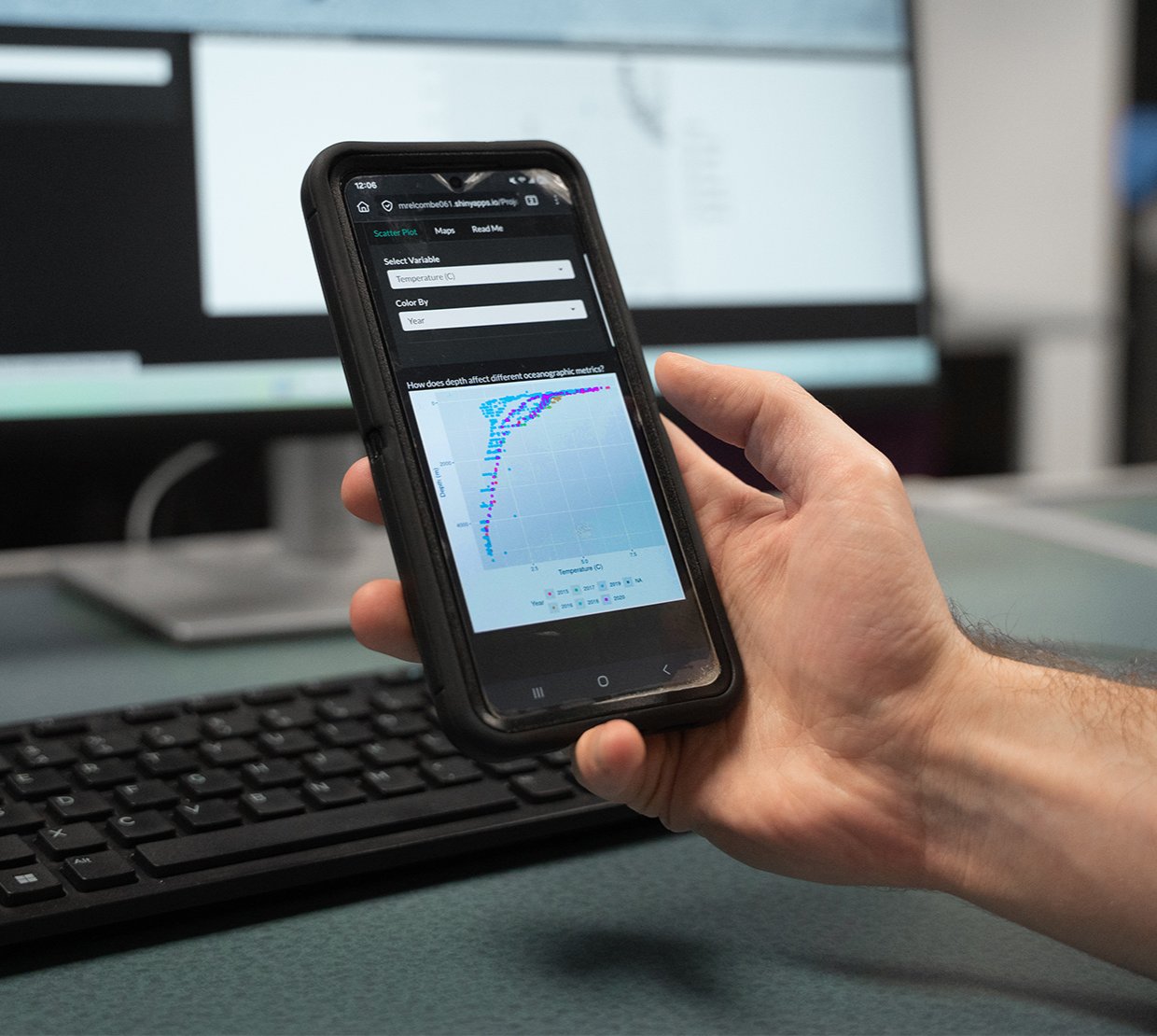
What do ocean currents, baseball statistics and insect populations have in common? These real-world systems have all become living datasets — transformed by students into interactive apps and digital stories in a new course in data visualization.

Senior statistics instructor Erin Howard designed the course to give students something rare: the chance to blend technical skills with creativity.

“Data visualization is the artsy side of statistics,” Howard said. “It’s about storytelling, making science and data transparent and accessible, and using creativity to connect with an audience.”

Another priority was ensuring work students produced felt meaningful. She wanted students to avoid what she calls “disposal assignments” and instead create projects they could use beyond the classroom, in resumes, graduate school applications, conference posters or even just to share with family.

A group os students pose for a photo.

The first cohort of ST 437 gathers of the end of the year Data Visualization Symposium.

Statistics with a twist

When Howard joined the faculty in 2020, she began thinking about how to make statistics feel more creative and accessible.

“The field of data visualization focuses on putting data into a digital format that can be understood and digested by anybody. It’s about transparency in science and policy,” she said.

Howard has received several recent honors for her teaching, including the Whiteley Faculty Scholar Award, the Center for Teaching and Learning Professional Development Award, and a Best Speed Session Award from the Statistical Education Section at JSM 2024 for her presentation “Enhancing Engagement in Introductory Statistics through Student-Centered Simulations.”

The course, ST 437: Data Visualization, which is offered in spring, is open to undergraduates from across the university, not just the College of Science. Students come from mathematics, psychology, business, agriculture and biological data sciences, each bringing unique datasets from their fields.

Howard said the mix of perspectives creates a dynamic environment. “Whatever a student's major is, there’s a place for them in data visualization,” she said.

Throughout the term, students explore foundational visualization techniques before developing a major project of their choosing. They identify or collect a dataset — sometimes from research labs, sometimes from online repositories like Kaggle — and design compelling and engaging visualizations.

One student created a Shiny app displaying species diversity across U.S. national parks. Another visualized genetic data to make complex research more understandable to the public. A third student, who worked for OSU Baseball, built a project exploring team statistics.

A man in a t shirt uses his cellphone.

Matthew Elcombe works on his Shiny app.

Stories in every dataset

For mathematics student Matthew Elcombe, the class became a chance to step outside his comfort zone.

A post-baccalaureate student from Santa Rosa, California, Elcombe had already earned a degree in music before returning to pursue mathematics with a statistics option. When he read about the new course, it stood out as something different.

“It seemed like a really fun course, more creative than most math classes,” he said. “I didn’t have much background in data visualization, but I liked the idea of combining analysis and design.”

Elcombe built an interactive Shiny app using oceanography data collected off the coast of South America. The dataset measured salinity, carbon dioxide and phosphorus at different depths, allowing him to visualize how ocean conditions changed over time and space.

Screenshot of a dataset showing points on a graph.

A screenshot of Elcombe's interactive Shiny app using oceanography data collected off the coast of South America.

He learned about effective design guidelines, including Gestalt principles.

“The first thing you see on a graph is usually the most important, so you have to know how to display your data in a way that lets people immediately see a pattern — not to manipulate it, but to highlight what matters.”

The class has already opened new doors for Elcombe. He refined his class project over the summer and added it to his graduate school portfolio.

Both Elcombe and Howard had similar favorite parts of the course, the final symposium. The symposium is supposed to mimic a conference poster session, but the poster is digital. This allows the presentation to be interactive or dynamic.

The symposium happens at the end of the term in Week 10. Half the class presents while the other half listens, and then the swap.

“A lot of the students made presentations that were super in depth, and it was cool seeing how they could express themselves and what they are interested in,” Elcombe said.

Image of Erin in front of brick wall wearing a gray shirt.

Erin Howard says the data visualization class has reminded her why she loves teaching.

Howard says the event teaches communication skills and the ability to inspect data in the real world.

“It teaches the students to scrutinize other visualizations and analyses that they see in the news and on social media. We spend time in class critiquing visualizations and noticing if anything is misleading. They learn how to look at reports and figure out what’s missing, what’s accurate or what’s not,” she said.

The class has reminded her why she loves teaching.

“One of my students told me she sent her first app to her parents,” she said. “I actually got teary-eyed. My stats students don’t usually send their parents their homework.”

Moments like that, she said, show the power of data visualization, not just to inform but to connect.

From ocean currents to baseball stats, Oregon State students are learning to use data not just to analyze the world, but to illuminate it.

Learn more about the ST 437 Data Visualization course and student projects.


Read more stories about: students, statistics, teaching innovation